> ## Documentation Index
> Fetch the complete documentation index at: https://wb-21fd5541-dependabot-github-actions-actions-cache-6.mintlify.site/llms.txt
> Use this file to discover all available pages before exploring further.

> メトリクスを可視化し、軸をカスタマイズして、カテゴリデータを棒で比較します。
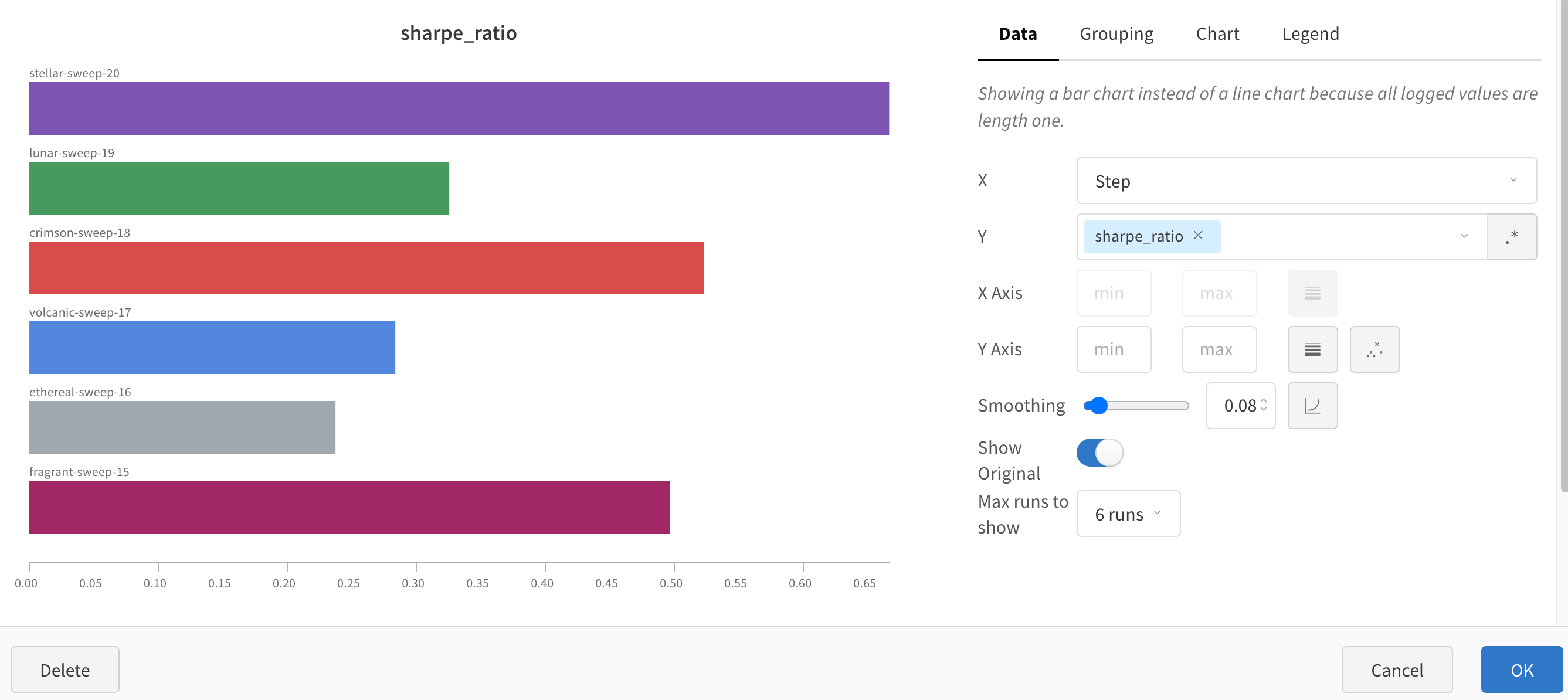
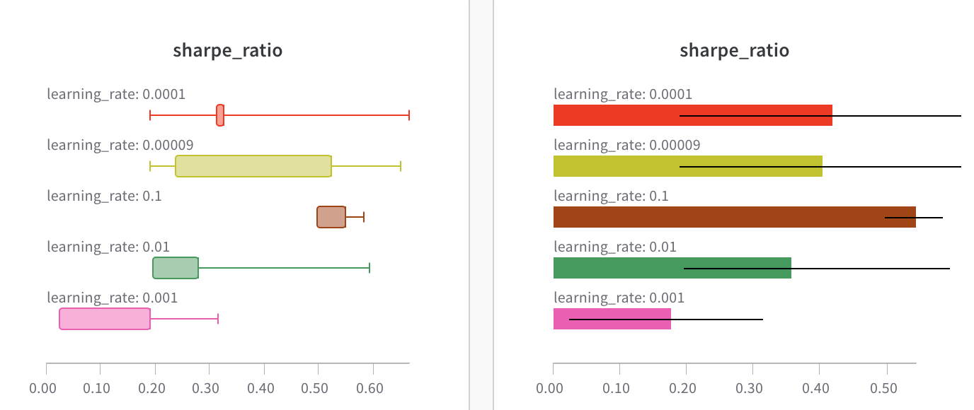
# 棒グラフ

棒グラフは、縦または横に描画できる長方形の棒でカテゴリデータを表現します。棒グラフを使用すると、メトリクスを可視化し、カテゴリデータを比較し、Runs の軸をカスタマイズできます。ログされたすべての値の長さが 1 の場合、`wandb.Run.log()` ではデフォルトで棒グラフが表示されます。

<Frame>
  <img src="https://mintcdn.com/wb-21fd5541-dependabot-github-actions-actions-cache-6/u6Zj7BAeqPxz14yi/images/app_ui/bar_plot.png?fit=max&auto=format&n=u6Zj7BAeqPxz14yi&q=85&s=22e9452a1be4fe09805dce8b011963bd" alt="W&B の箱ひげ図と横棒グラフ" width="1376" height="580" data-path="images/app_ui/bar_plot.png" />
</Frame>

チャート設定を使用すると、表示する Runs の最大数を制限し、任意の設定で Runs をグループ化し、ラベル名を変更できます。

<Frame>
  <img src="https://mintcdn.com/wb-21fd5541-dependabot-github-actions-actions-cache-6/u6Zj7BAeqPxz14yi/images/app_ui/bar_plot_custom.png?fit=max&auto=format&n=u6Zj7BAeqPxz14yi&q=85&s=7666a0764df2bd20a49b9e990b003f92" alt="カスタマイズした棒グラフ" width="2674" height="1194" data-path="images/app_ui/bar_plot_custom.png" />
</Frame>

<div id="customize-bar-plots">
  ## 棒グラフをカスタマイズする
</div>

**Box** または **Violin** プロットを作成して、複数のサマリー統計を 1 つのチャートタイプにまとめることもできます。

Box または Violin プロットを作成するには、次の手順に従います。

1. Runs table で Runs をグループ化します。
2. Workspace で **Add panel** をクリックします。
3. 標準の **Bar Chart** を追加し、プロットするメトリクスを選択します。
4. **Grouping** タブで **Box** または **Violin** を選択すると、これらのスタイルでプロットできます。

<Frame>
  <img src="https://mintcdn.com/wb-21fd5541-dependabot-github-actions-actions-cache-6/u6Zj7BAeqPxz14yi/images/app_ui/bar_plots.gif?s=af093fed10b0f77d7a85b70f0bd627c6" alt="グループ化オプションを使用して棒グラフをカスタマイズする" width="800" height="395" data-path="images/app_ui/bar_plots.gif" />
</Frame>
